This blog is part 1 of the web component series. In this blog , we will learn about web components and create our first web component using vanilla javascript.
Outline
1. What is a web component?
2. Advantages and challenges of web components.
3. Creating your first web component.
4. Conclusion.
What is a web component ?
A web component is a reusable , custom html tags that can be used in our web application. The functionality of a web component will be separated from the rest of the web application code which avoids code collision.
They follow existing W3C specifications and works well in all modern web browsers. Polyfills comes into rescue if the component has to be used in the old browser.
It can be used with any web frameworks React, Vue or Angular.
It consists of three main technologies
- Shadow DOM
- Custom Elements
- HTML Templates
Let's quickly have a look on what exactly are these things
Shadow DOM :
Shadow DOM is a scoped DOM tree which is attached to a element , but separate from the main DOM. The element which it is attached to is called the Shadow Host and the scoped sub tree is called the Shadow Tree .
Anything attached to Shadow Host is only accessible locally, by this way CSS and scripting of the web component is isolated from the rest of the application code.
Custom Elements :
Custom elements provide a way to build their own fully-featured DOM elements.
Definition of Custom Elements
HTML Templates:
Custom templates in HTML which are not rendered unless and until they are instantiated. and tags allows us to achieve that.
Definition of template tags.
Advantages :
- Ability to create a reusable component.
- Encapsulated functionality of the component provides private scope , hence reducing code collision.
- platform independent.
Challenges:
- More web components in the web application leads for the browser to figure out to render the DOM tree which affects the load time that in turn affects the performance of the web application.
- Search Engine might have hard time in indexing the custom elements.
Now to fun part , let's create our first simple web component using vanilla JS.
Creating a web component:
Let's scaffold our project. Head over to your terminal and run the following command
mkdir user-card-web-component
cd user-card-web-component
Create index.html in the root of the directory and paste in the following content
<!DOCTYPE html>
<html lang="en">
<head>
    <meta charset="UTF-8">
    <meta http-equiv="X-UA-Compatible" content="IE=edge">
    <meta name="viewport" content="width=device-width, initial-scale=1.0">
    <title>Dev Card Web Component</title>
</head>
<body>
<!-- Usage of the web component in html file -->
    <dev-card
    name="Karthikeyan Shanmugam"
    work="Front-end Engineer"
    photo="https://avatars.githubusercontent.com/u/23126394?v=4"
    github="https://github.com/skarthikeyan96"
  ></dev-card>

  <script src="./dev-card.js"></script>
</body>
</html>
Now go ahead and create dev-card.js in the root of the project folder and paste the following content.
class DevCard extends HTMLElement {
    constructor() {
      super();

      this.name = "";
      this.work = "";
      this.photo= "";
      this.githubUrl = "";
    }

    connectedCallback() {
    /**
     * It is called each time when the custom element is appended to the DOM
     */
      this.name = this.getAttribute("name");
      this.work = this.getAttribute("work");
      this.photo = this.getAttribute("photo");
      this.githubUrl = this.getAttribute("github");
      this.renderComponent();
    }

    renderComponent() {
      this.innerHTML = `
        <div style="text-align: center">
          <div>
          <img src=${this.photo} style=" vertical-align: middle;
          width: 50px;
          height: 50px;
          border-radius: 50%;"/>
          </div>
        <h3> Name : ${this.name}</h1>
        <p> Work: ${this.work}</p>
         <a href=${this.githubUrl}> Visit Github profile </a>
        </div>
        `;
    }
  }

  customElements.define("dev-card", DevCard);
Code Explanation
In creating custom elements, we use ES6 Class which extends the interface
HTML Element.connectedCallback() is a life cycle of an HTML element that will be called when the element is successfully added to an HTML document (DOM). Also on this connectedCallback(), we call render() to display the contents of the custom element.
renderComponent() is used to set the content of a custom element.
Other names can be used for the renderComponent function.
So, when the dev-card is successfully added to the DOM, the html elements that are wrapped in
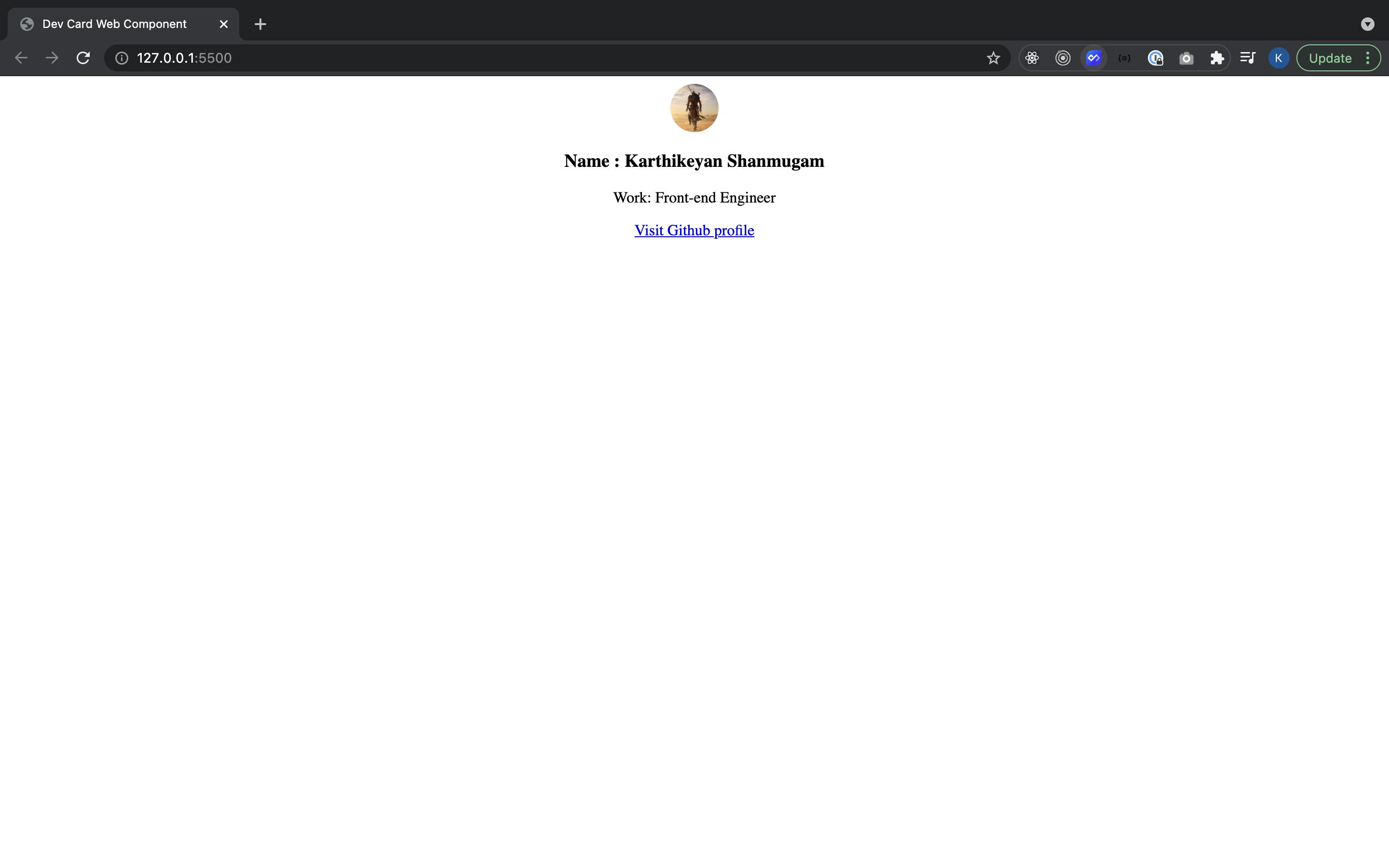
Open the index.html file using a web browser or you can double click the file. If successful, it will appear as shown below:

Congratulations. You have successfully created your first web component.
Conclusion:
Thank you for reading the blog. Part 1 of the web component series concludes. If I have missed something , let me know in the comments.
Stay tuned for part 2.

Spoiler :
In part 2 , we will be upgrading the dev card component which we created by consuming hashnode api , adding light and dark mode themes and also publishing our web component to the Web components.org library.
